 Seller OS
Fiverr gig analytics: what the numbers mean
Fiverr gig analytics is the statistics panel attached to each of your gigs: impressions, clicks, orders, conversion rate, cancellation rate, current subscriptions, and delivery info such as average delivery time and orders in queue. Read it per gig, because each number answers one question about how that listing moved through the last 30 days.
This guide explains what each statistic counts, the order to read them in, how to compare a period with the one before it, and where cross-gig comparisons mislead. Fiverr does not publish how often the panel refreshes, and the guide stays honest about that limit.
Free plan available. Local-first data. Human review on every change.
Where your gig statistics live
The per-gig numbers are not only in the account-level analytics area. Fiverr's Managing your Gigs article describes opening My Business, then Gigs, clicking a gig title, and scrolling down to a panel with impressions, clicks, orders, cancellation rate, current subscriptions, conversion rate, and gig info such as average delivery time and orders in queue.
The performance graph above those statistics switches between Impressions, Clicks, Orders, and Conversion rate, and Fiverr says the graph shows statistics over the last 30 days. The same article states statistics are displayed for the past 30 days by default. Fiverr documents the full panel for desktop browsers and notes gig statistics are not available in the app, while a separate help article describes a seven-day app view.
Two account-level areas sit above the per-gig panel and answer different questions: the analytics overview covers earnings, average selling price, on-time delivery, cancellations, and client countries, while the per-gig panel covers how one listing performed. The Fiverr analytics guide covers that account view; this guide stays with the gig.
What each number actually counts
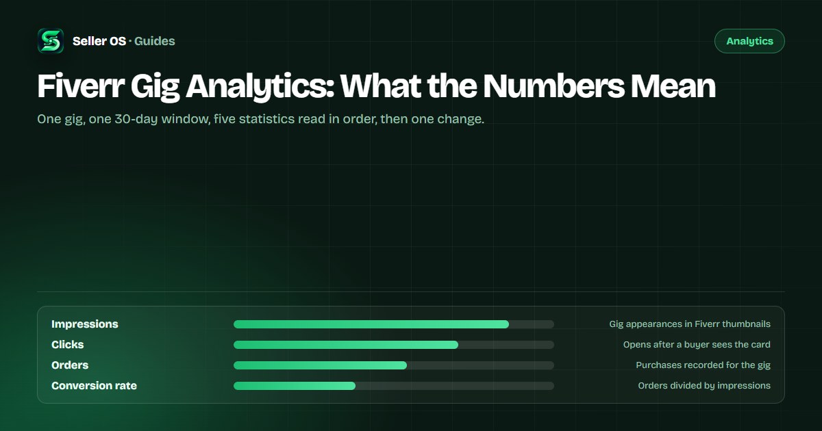
Fiverr defines impressions as the number of times your gig appeared in Fiverr thumbnails, including the homepage, category and subcategory pages, search results, and user profile pages. Clicks are the times a user clicked on your gig after seeing it on one of those surfaces. Both count appearances and actions, not unique people.
Orders are purchases recorded for the gig, and the dashboard's conversion rate divides those orders by impressions. That differs from the click-based conversion Seller Plus describes, where the question is how often a client ordered after clicking. The impressions vs clicks vs orders guide walks through the full funnel.
| Statistic | What it counts | The question it answers |
|---|---|---|
| Impressions | Gig appearances in thumbnails and listings | Did the gig get seen? |
| Clicks | Clicks on the gig after it was seen | Did the card earn attention? |
| Orders | Purchases recorded for the gig | Did attention become work? |
| Conversion rate | Orders divided by impressions | How often appearances end in orders? |
| Cancellation rate | Cancellations connected to the gig | Is delivery falling through? |
| Subscriptions | Current subscribers on the gig | Is recurring demand present? |
A diagnostic order for one gig
Read the panel as a chain, not a scoreboard. Each statistic filters the one before it, so start where the chain looks weakest and let that decide what you examine next. Comparing all five numbers at once usually produces a plan you cannot test.
Worked through quickly: if impressions are healthy and clicks are not, the card needs attention. If clicks are healthy and orders are not, the page, the package fit, the proof, or your reply speed does. If orders are healthy but cancellations appear, the delivery signals at the bottom of the panel deserve the next read.
Start with impressions
no traffic makes the argument about visibility, not copy or price
Check clicks next
plenty of impressions with few clicks points at the card
Move to orders
steady clicks without orders point at the page, offer, or conversation
Read conversion last
it combines the two steps above into one ratio
Finish with delivery signals
cancellation rate, average delivery time, and orders in queue
Reading movement without overreacting
Fiverr marks each statistic with a trend arrow: a red arrow means a drop from the previous period selected, and a green arrow means an increase. The comparison is against the period before, so changing the window length changes the story before you have touched the gig.
Hypothetical example: a gig records 4,000 impressions and 80 clicks in one 30-day window, then 5,200 impressions and 84 clicks in the next. Impressions rose 30 percent while the click share fell. That pattern usually points to a broader placement rather than a broken card, and it can still be a win if orders held or grew. Write both windows down before deciding.
One check before reacting: does the movement show in the graph and in the raw numbers, or only in an arrow? A single red arrow on a small base is often noise. Fiverr does not publish a refresh cadence, so treat the panel as a snapshot of the last 30 days rather than a live feed, and let a window pass before rewriting anything.
Why cross-gig comparisons mislead
Two gigs from the same seller can face different categories, price points, and buyer intents, so a lower conversion rate on one is not automatically the weaker gig. Impressions are also counted across the homepage, category pages, search, and profile surfaces, and a broad placement can inflate the denominator without changing interest.
A common mistake is treating conversion rates as a scoreboard between gigs and rewriting the lower one to match. Compare each gig with its own previous window instead, and use the account-level analytics for direction across the business. The Fiverr analytics guide covers that account view.
Turning the read into one decision
Pick the weakest transition, change one thing that could move it, and give the change a full 30-day window before reading the panel again. Stacking a new thumbnail, a rewritten title, and a price change into the same window leaves you unable to say which one worked.
Keep a one-line log for each gig: the date, the raw numbers, and the single change. The log is what turns a dashboard into a history; without it, every month is a fresh mystery with no comparison available. Raw counts also preserve the sample size that percentages hide.
Where Seller OS helps
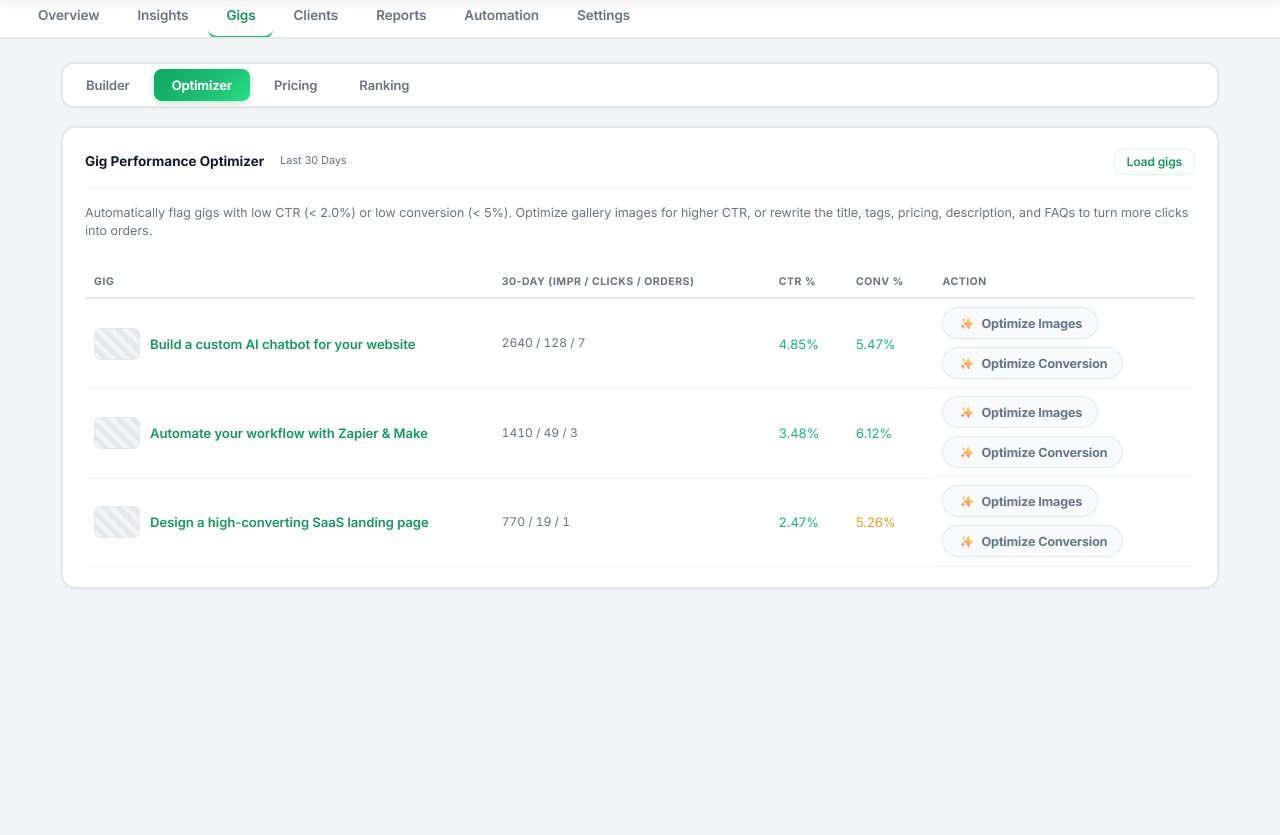
Seller OS connects the panel to a plan. The Gig Performance Optimizer reviews a live gig's copy, gallery, and conversion signals against the gig's own performance data and proposes changes, so a read produces a short list instead of a rewrite. Reports and the action queue keep that list visible without a separate spreadsheet.
Keyword rank tracking supplies the other half of the visibility story: tracked phrases, position history, and movement over time, kept in Chrome local storage. The optimizer proposes and fills nothing into Fiverr on its own; you approve every edit before it happens.
Fiverr Gig Analytics questions
Where do I find per-gig analytics on Fiverr?
Open My Business, then Gigs, click the gig title, and scroll down. The statistics panel lists impressions, clicks, orders, cancellation rate, current subscriptions, conversion rate, and delivery info. Fiverr displays the past 30 days by default, the graph switches between the four traffic statistics, and the full panel is documented for a desktop browser.
What does the conversion rate mean on a per-gig panel?
It is the total number of orders divided by the total number of impressions for that gig, per Fiverr's help center. Because the denominator is impressions rather than clicks, it reads lower than the click-based conversion Seller Plus describes. Use it as a per-gig trend, not as a target pulled from somewhere else.
How often do Fiverr gig statistics update?
Fiverr does not publish a refresh cadence for the standard per-gig panel, so there is no official answer to check against. The practical response is to read the panel at the end of a window rather than hourly, and to compare equal windows so the comparison itself stays valid.
Should I compare my gigs against each other?
Only loosely. Each gig faces its own category, price level, and buyer mix, and impressions are counted across several surfaces, so ratios are not directly comparable. Compare each gig with its own previous window and use the account-level analytics for direction across the business.
Read one gig, one number at a time
Open a gig's statistics, write down the last 30 days, and choose one transition to improve.