 Seller OS
Fiverr analytics explained: a map of every view
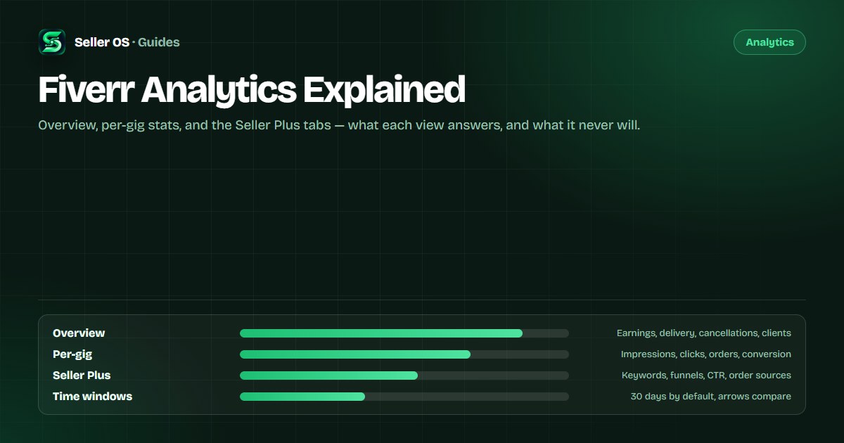
Fiverr analytics is not one dashboard; it is a small set of views with different jobs. The Overview tab answers what the account earned and delivered, per-gig statistics answer what one listing did, and the keyword and funnel tabs sit behind Seller Plus.
This guide maps every documented view, explains the default 30-day window and the arrows that compare periods, flags the definitions that conflict between Fiverr's own pages, and says plainly what the numbers cannot tell you.
Free plan available. Local-first data. Human review on every change.
The map: six tabs, two access tiers
Fiverr's Analytics page has six tabs: Overview, Repeat business, Gig performance, Orders breakdown, Top keywords, and Keyword research. Only Overview and Repeat business are standard; Fiverr's own article states the other four are available exclusively to Seller Plus members. You reach the page from Analytics in the top navigation, then choose a tab.
The table below maps each view to the question it answers. If you remember one thing, remember the split: the free layer tells you what happened, and the paid layer tells you why — by keyword, by traffic source, and against your subcategory.
| View | Question it answers | Who sees it |
|---|---|---|
| Overview | What did the account earn and deliver? | All freelancers |
| Repeat business | How much comes from returning clients? | All freelancers |
| Gig performance | How does a gig compare to its subcategory? | Seller Plus |
| Orders breakdown | Where did the orders come from? | Seller Plus |
| Top keywords | Which search terms found the gig? | Seller Plus |
| Keyword research | What is happening across the marketplace? | Seller Plus |
What the Overview tab shows you
The last 30 days are displayed by default, and a date-range drop-down changes the window. Fiverr's sales analytics article describes the tab's contents: total earnings — cleared payments plus Customer Support compensations — an Average Selling Price defined as total earnings divided by completed orders, and the count of total orders completed since the account opened.
Two operational numbers sit alongside the money. On-time delivery appears as the percentage of orders delivered on time over the last 60 days, and the cancellations breakdown covers the last 60 days, including who initiated each cancellation and the top reasons. A world map closes the tab with each client country's share of sales.
One more note: the Sales section, the timeline graph of earned, cancelled, and new orders, is no longer part of the current Analytics page, according to the article's own FAQ. If a tutorial still references it, the tutorial is older than the dashboard.
- Earnings show cleared money, not spendable money.
- Average Selling Price divides by completed orders.
- On-time delivery and cancellations both look back 60 days.
Per-gig statistics and their definitions
Per-gig statistics live under My Business, then Gigs: click a gig title and scroll down, as Fiverr's Managing your Gigs article describes. Fiverr lists impressions, clicks, orders, cancellation rate, current subscriptions, and conversion rate, plus gig info such as average delivery time and orders in queue. The graph switches between impressions, clicks, orders, and conversion rate, shown for the past 30 days by default, with arrows comparing the selected period to the one before it.
The definitions are where most misreadings start. Fiverr defines impressions as the number of times your gig appeared in thumbnails — homepage, category and subcategory pages, search results, and user profiles — and the per-gig conversion rate as orders divided by impressions. Seller Plus describes conversion per click instead, and the app describes orders resulting from clicks after views.
Those are three different official definitions for the same label, so note which screen produced a number before comparing it with anything. CTR, for example, is not shown on the standard per-gig dashboard at all; it appears only in Seller Plus views.
Periods, arrows, and small samples
Match your windows before comparing anything. The analytics default to 30 days, on-time delivery looks back 60 days, and the repeat business score compares client retention in your subcategory over the last 90 days. Green and red arrows compare the selected period with the previous one, so changing the window length changes the story.
At low volume, percentages lie politely. A gig with nine orders one month and eight the next has not lost much — but a conversion percentage built on those counts can swing by whole points because one order moved. Read the counts under the percentage, and treat tiny samples as noise.
| Metric | June | July | Read |
|---|---|---|---|
| Impressions | 2,400 | 2,900 | Traffic grew |
| Clicks | 120 | 131 | Fewer clicks per impression |
| Orders | 9 | 8 | One order is a large share |
| Conversion | Under 0.4% | Under 0.3% | Watch counts, not the rate |
Keyword data sits behind Seller Plus
The Top keywords tab shows which search terms clients used to find your gig, with impressions, clicks, orders, and earnings for each. Fiverr's guidance on the same page is worth remembering: the algorithm prioritizes title text first, then the positive keywords field, then the description, and new or updated keywords should get at least 30 days before you review their impact.
Keyword research widens the lens to the marketplace, showing search terms across Fiverr with overall rank, search volume, average order price, conversion rate, and competition. Both tabs are Seller Plus and web-only, and there is no public Fiverr keyword tool outside the account — anything claiming to be one is a third-party product.
Two more Seller Plus views round out the map. Orders breakdown lists where orders came from — organic traffic, Fiverr Ads, coupons, buyer briefs, Fiverr's Choice, and Fiverr Pro — with a funnel view for organic and ad traffic; if you run ads, Fiverr Ads vs organic and How to optimize Fiverr Ads take the budget questions from there. Gig performance places your CTR and conversion side by side with your subcategory average.
What Fiverr analytics cannot tell you
Start with what is not published. The Success Score formula, its weights, and its exact lookback window are not public, and the score lives on the level overview page rather than in analytics. No benchmark figures are published either, so any target percentage you see quoted for CTR or conversion is someone's private average.
Then the smaller blind spots. Impressions count appearances, not unique people. Fiverr does not publish how often statistics refresh. And the analytics describe what moved, never why, so the cause still has to come from your log of changes, orders, and messages.
A related trap is comparing a standard-account number with a Seller Plus number that carries a different definition — orders per impression against orders per click — and reading the gap as performance. Name the screen before you name the trend.
Two habits that make the map useful
First, review on a fixed cadence with a fixed window. Monthly matches the 30-day default and gives each change time to show up; the routine in the gig performance guide turns that into five questions and one decision.
Second, write down the definition and the screen behind each number you record, especially conversion. The definitions conflict between dashboard, Seller Plus, and app, and a log that does not say which one it used will eventually compare two different measurements and call it a trend.
Neither habit is clever, and that is the point. The dashboard changes, definitions differ by tier, and memory fades; a dated note with the screen named is the cheapest insurance this data has.
Where Seller OS helps
Seller OS sits alongside the dashboard rather than replacing it. Reports assemble the numbers from your tracked gigs and keywords into readable periods, so a 30-day window is not the only memory of how a listing performed, and the overview shows what is moving between dashboard visits.
The rank tracker adds the piece Fiverr's analytics does not keep for you: position history for keywords you choose, sampled over time. It changes nothing in your account, reads only what you can already see, and stores its records in Chrome local storage.
Fiverr Analytics Explained questions
What is included in Fiverr Analytics?
The Analytics page has six tabs: Overview and Repeat business for all freelancers, plus Gig performance, Orders breakdown, Top keywords, and Keyword research for Seller Plus members. Per-gig statistics sit under My Business, in Gigs. Fiverr's app documentation also describes a shorter seven-day version of gig statistics.
Why can't I see CTR in Fiverr analytics?
Fiverr documents click-through rate only in Seller Plus views, such as Top keywords and Gig performance, not on the standard per-gig dashboard. You can still divide your own clicks by impressions as rough arithmetic, but label it as your own calculation rather than an official metric.
How far back does Fiverr analytics go?
The analytics default to the last 30 days, and the date drop-down changes the window, though Fiverr does not publish a maximum history length. Some metrics carry their own lookbacks: on-time delivery covers 60 days and the repeat business score compares 90 days. Match windows before comparing periods.
Why do app and desktop stats disagree?
The app article documents a seven-day window with impressions, clicks, views, and conversion, while desktop per-gig statistics default to 30 days and do not define views at all. Fiverr's own pages also disagree on whether app stats exist, so compare like with like and note which screen produced each number.
Read the view before you read the trend.
Match your windows, note the definition behind each number, and end each review with one decision.