 Seller OS
Fiverr gig images that earn the click
Buyers compare your gig as a small card beside a dozen others before they read a word. The main image decides whether they open your page, and the gallery decides whether they believe the promise once they arrive. Weak images lose the visit; strong ones make the description worth reading.
This guide covers the creative system behind clicks: what the main image must do versus the gallery, how to stay legible at thumbnail scale, which proof conventions buyers trust, and how to order the set. Pixel specs and upload mechanics belong to the size guide; this page is about what the images show.
Free plan available. Local-first data. Human review on every change.
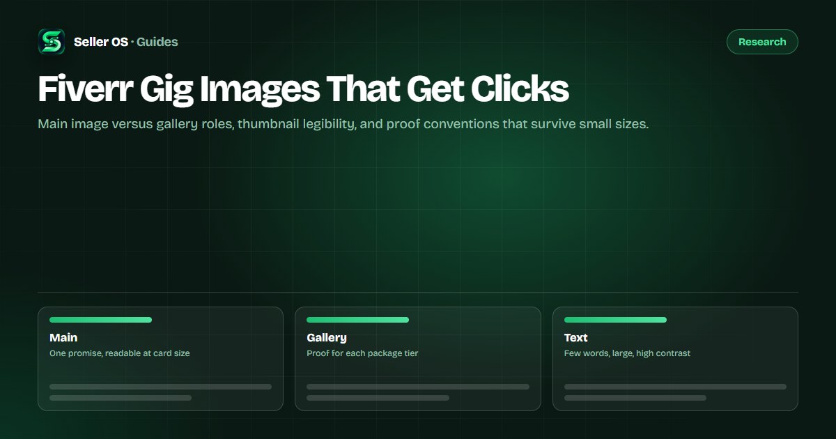
Main image versus gallery roles
The main image has one job: stop the scroll with a single readable promise. It shows the deliverable category, one short phrase, and a visual style that matches the work. Everything else, process shots, tier differences, format details, belongs deeper in the set.
Gallery slots two through four each prove one claim the main image makes. If the main image promises fast turnaround, slot two shows a dated delivery example. If it promises a style range, slots three and four show two distinct finished pieces. Buyers who click should find confirmation, not a new topic.
- Slot one: the category, one phrase, one style, readable as a card.
- Slot two: the strongest proof piece for the core promise.
- Slots three and four: tier or style variants tied to packages.
- Later slots: process, formats, and answers to common doubts.
Legibility at thumbnail scale
Design at card size first and full size second. Shrink every draft to the width of a search card and read it before you approve it. If the headline needs squinting, cut words before you enlarge type, because most sellers try to fit a paragraph where five words belong.
Keep to one headline of three to six words, one supporting detail at most, and contrast that survives both light and dark browsing. Thin scripts, low-contrast overlays on busy photos, and tiny before-and-after splits all fail the same test: they look crafted full-size and vanish in results.
| Check | Pass | Fix |
|---|---|---|
| Word count | Three to six words | Cut to one promise |
| Contrast | Reads on phone brightness low | Add panel behind text |
| Subject size | Deliverable fills half the frame | Crop tighter |
| Card test | Clear at search-card width | Rebuild, do not enlarge |
Proof conventions buyers trust
Buyers trust images that look like the work they will receive. Finished deliverables photographed or exported cleanly beat mockup collages, and paired before-and-after frames beat single beauty shots for transformation work like editing, restoration, and design cleanup.
Label proof honestly. Mark concept pieces as concepts and client work as client work where permission allows, and never present stock or template previews as your own delivery. The video guide follows the same rule: show the result first, then the brief process that produced it.
- Finished pieces: export or photograph the actual deliverable.
- Before and after: same framing, same lighting, labeled clearly.
- Process proof: one timeline, draft, or layer view, not a full tutorial.
- Honest labels: concept, sample, or client work stated as it is.
Order and caption the set
Order the gallery the way buyers decide. The click brings curiosity, the second image should confirm quality, the third should map to packages, and the fourth should remove the most common doubt, such as source files, revisions handling, or delivery format.
Lead with the promise
main image carries one outcome, not a menu.
Confirm with proof
second slot holds your strongest finished piece.
Map to tiers
third slot shows what differs between packages.
Remove doubt
fourth slot answers the top FAQ visually.
Caption each image
one plain sentence tying the image to a package or FAQ.
Mistakes that cost clicks
The costliest mistake is a main image that describes the seller instead of the deliverable: a portrait, a credential badge wall, or a tool logo collage. Buyers search for outcomes, and a face without work gives them nothing to compare. Put yourself in the video or profile, not in slot one.
Next come crowded collages that shrink four portfolio pieces into unreadable stamps, and style drift where the gallery shows work the packages cannot reproduce. When clicks stall but impressions hold, the main image is usually the fault; when clicks convert poorly after opening, the gallery proof is thin. The impressions-without-clicks guide separates those two diagnoses, and the click-through guide shows how to measure the fix.
Where Seller OS helps
Seller OS reviews your gallery the way buyers see it: card size first, proof order second. The gig optimizer flags mismatches between what your images promise and what your packages describe, so the click and the offer agree.
Image files and upload choices stay entirely yours. The extension drafts captions and checklists locally and never edits or publishes your gallery; you approve every visual before it reaches Fiverr.
Fiverr Gig Images That Get Clicks questions
How many images should a Fiverr gig gallery hold?
Three to five strong images beat eight mixed ones. Lead with the promise, follow with your best proof, map one slot to package tiers, and close with the top doubt removed. Add the video separately for process proof. Remove any image that repeats a claim instead of proving a new one.
What text belongs on a Fiverr gig main image?
Three to six words naming the buyer outcome, plus at most one short detail like format or turnaround. Design it to read at search-card width on a phone with low brightness. If the phrase needs a second line to make sense, shorten the promise rather than shrinking the type.
Do before-and-after images work on Fiverr?
Yes for transformation work such as editing, cleanup, restoration, and redesign, when both frames share the same cropping and lighting and are labeled honestly. They fail when the pairing is tiny, the change is exaggerated by filters, or the sample does not match what packages deliver. Keep pairs large and truthful.
Why does my gig get impressions but no clicks?
That pattern usually points at the main image or title rather than ranking. Test one change at a time: simplify the headline to one promise, raise contrast, crop tighter on the deliverable, then recheck click data after enough impressions. Keep the gallery proof aligned so new clicks meet confirmation instead of confusion.
Make slot one readable at card size.
One promise on the main image, proof in the gallery, captions tied to packages.