 Seller OS
Fiverr gig thumbnail: how to choose one that earns clicks
Your gig thumbnail is the first image in your gallery, and for most buyers it is the only one they will see. Fiverr uses that image on gig cards in search results, category pages, and your profile, which means it has to work at the size of a postage stamp, not the size of a design board.
This guide covers what the first image must communicate at card size, how to make text survive shrinking, the honest-preview rule, the mistakes that cost clicks, and a two-week test you can run without touching the rest of the listing.
Free plan available. Local-first data. Human review on every change.
What buyers see before they click
Fiverr defines impressions as the number of times your gig appears in thumbnails, including on the homepage, category and subcategory pages, search results, and profile pages. In every one of those placements, the first thing a buyer processes is your image, and it is already doing its job before anyone reads your title.
That placement is the design brief. The card is small, it sits in a grid of competitors, and it is scanned in a fraction of a second. A thumbnail is not a portfolio page or a banner ad; it is a sign that tells the right buyer 'this is for you' and tells everyone else to keep scrolling.
One element on the card is not yours to control: Fiverr adds level badges and ad badges automatically. That leaves the image as the biggest asset you can shape for the click, which is also why it is the first thing to test when clicks stall.
The one-idea rule that survives shrinking
Design the thumbnail so a stranger can name what you sell after one glance. One subject, one focal point, one reason to care. A single logo mockup on a clean background beats a collage of five deliverables, because nobody can decode a collage at card size.
Hypothetical example: a logo designer builds two thumbnail options. Option A shows nine logo variations in a tidy grid, which looks generous at full size. Option B shows one coffee-shop mark with the words 'coffee brand identity'. At card size the grid collapses into visual noise, while the single mark and its label stay readable. Option B carries one idea; option A carries nine competing ones.
The test is simple. Shrink your image to roughly the width of a search-result card, place it next to three competitor images, and look at it for one second. If you cannot say what the gig sells, the thumbnail is asking the buyer to work, and most will not.
Text that still reads at thumbnail size
Fiverr's gallery guidance keeps on-image text to no more than 10 words, and for a thumbnail that ceiling is generous. Three to five words is the working maximum: the deliverable or the outcome, set large enough to read at card size with a typeface that does not thin out.
Practical rules that travel well: pick one typeface; keep two steps of contrast between text and background; avoid placing text where the card overlay or crop varies; and never rely on thin, light letterforms. If the words are unreadable when you zoom the browser out, they are decoration rather than communication.
Contrast beats color count. A two-color thumbnail with one strong background and one clear subject reads instantly; a saturated background with four accent colors feels loud alone and dissolves into mud beside a page of similarly loud cards. Legibility at small size is what earns the click.
An honest preview of the deliverable
The strongest thumbnails show real work or a faithful representation of it. When the image promises a style and the gig delivers another, the buyer who clicked feels misled, and that expectation gap is one of the common reasons a gig gets clicks but no orders. The clicks without orders guide covers that diagnosis in full.
If your portfolio is thin, build the image from the closest real sample you have and label the offer instead of using a generic stock scene that could belong to anyone. Buyers compare five cards at once; the one that looks like it was made for them wins the click.
How to test a thumbnail without guessing
Treat the thumbnail like any other listing change: one variable, one window, one comparison. Standard analytics does not display click-through rate - that figure appears in Seller Plus reporting - so track clicks divided by impressions across equal windows as your own ratio, and keep the rest of the listing frozen while the test runs.
Hypothetical example: a gig records 12 clicks on 1,200 impressions in the two weeks before the swap, then 19 clicks on roughly the same exposure afterward. Clicks per impression moved from 1 in 100 to about 1 in 63. The numbers are invented to show the arithmetic, not a target; what matters is comparing your own windows on a similar traffic base.
Save the current image - keep the original file and note its exact size
Swap only the first image - leave the title, tags, and gallery order untouched
Write down the start date - with the clicks and impressions from the window before
Wait two weeks - then compare clicks per impression on a similar traffic base
Keep or restore - one better window is a hint, two in a row is a decision
Thumbnail mistakes that cost clicks
The most common mistake sellers make is designing the thumbnail at full browser size and never checking it small. A composition that breathes at 1280 pixels can turn into an unreadable smear at card width, and the exported file is what buyers actually see, not the artboard.
The second is painting badges, ratings, or Fiverr logos onto the image. Fiverr's gallery guidance states that badges are added automatically and asks sellers not to add Fiverr logos, ratings, or level badges themselves, so a painted-on badge competes with the real one and risks looking outdated as your account changes.
The third is making all three gallery images look like variations of the same card. The first image earns the click; the other two answer questions for the buyer who already clicked. Repeating one layout three times wastes slots that a competitor is using to show proof.
What the other two images should do
The first image earns the click; the next two answer the questions that decide the order. A common split is proof for one - a second sample that shows range - and process for the other: what the buyer receives, what a revision looks like, or the steps from brief to delivery.
Keep the visual language consistent across the three: same fonts, same palette, same level of text density, so the gallery reads as one offer rather than three unrelated designs. The specs for each slot, including the PDF and video options, are in the image size guide.
For the whole-gig version of this question - promise, proof, packages, and delivery - see how to make your gig stand out. The thumbnail is one lever; it works best when the rest of the gig agrees with it.
Where Seller OS helps
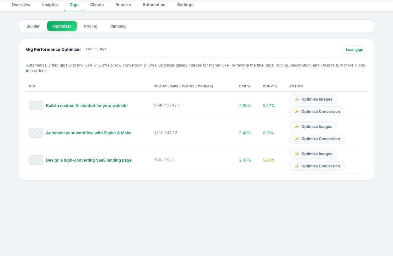
Seller OS helps you choose the thumbnail test rather than guess at it. The Gig Performance Optimizer reviews a live gig's copy, gallery, and conversion signals against the gig's own performance data and proposes changes, which is useful when the question is whether the first image, the title, or something lower on the page deserves the next window.
If the gig does not exist yet, the Gig Builder turns a one-line idea or a competitor URL into a structured gig and fills Fiverr's wizard for your review, gallery included. It proposes; you perform the upload, the Save, and the Publish, and the data stays in Chrome local storage.
How to Choose a Fiverr Gig Thumbnail questions
Does the thumbnail use a different size from the other gallery images?
No. The thumbnail is simply the first image in the gallery, so it follows the same published specs (Fiverr recommends 1280 x 769 pixels). What differs is how it is read: buyers see it at search-result size, so check legibility there before you publish.
Should my gig thumbnail have text on it?
It can, but keep it minimal. Fiverr's guidance limits on-image text to no more than 10 words; for a thumbnail that appears at card size, three to five large, high-contrast words work better. If the words cannot be read at small size, they add noise instead of meaning.
How do I know if a new thumbnail is better?
Run a two-week test. Record the current clicks and impressions, change only the first image, and compare clicks per impression across equal windows once the new window closes. One better reading is encouraging; a second confirms it. Standard analytics does not display click-through rate, so build your own ratio.
Can I use the same image for several gigs?
You can, but it usually hurts both listings. Identical images make it harder for buyers to tell your offers apart and for each gig to earn its own signals. Give every gig a thumbnail that reflects its specific promise, and keep the style consistent rather than the exact image.
Give your thumbnail a fair test
Save the old image, swap one asset, and compare two equal windows before deciding.